BUCK
Easy Money
Brand
Experience
Strategy
Technology
Deliverables
Product brand strategy & identity, Brand guidelines, Creative direction, App UI
Client
Buck
Industry
Fintech
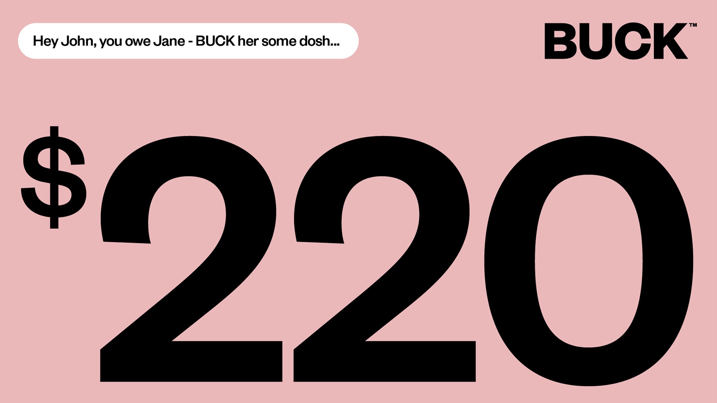
BUCK is a peer-to-peer payments app designed to remove the awkwardness from money conversations. We created an approachable identity centred on BUCK: a friendly money helper who makes sharing costs feel less transactional and more human. With a distinctive voice, playful character and visual system, the brand helps people navigate everyday money moments with friends, from splitting bills to sending cash. The result is a fintech experience that feels clear, easy and refreshingly free of friction. BUCK – easy money.
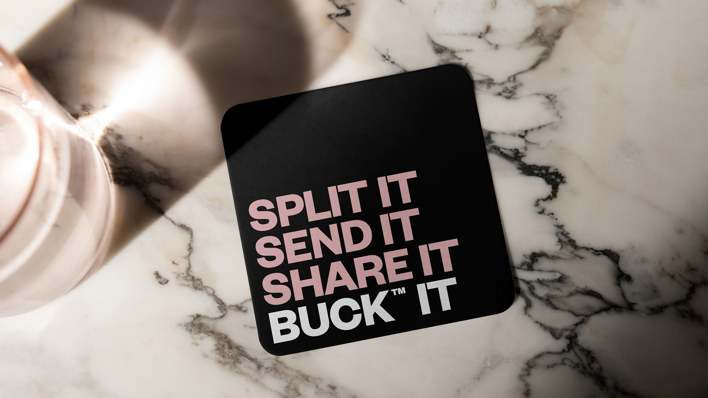
Identity Strategy
Money between friends can feel complicated, so BUCK needed to feel human rather than financial. The identity combines bold typography, a minimal palette and playful language to make peer-to-peer payments feel straightforward and familiar. Every element supports one clear promise: taking the tension out of everyday money moments between people.

Character Design
BUCK turns a payment service into a helpful, memorable presence. Built from a simple coin form, expressive eyes and graphic linework, the character brings warmth and movement to the identity. BUCK can react, guide and reassure across the experience, giving the brand a recognisable face without making money feel childish.




Project Team